heatmap
Heatmap showing the relationship between two categorical columns and a numerical column.
Usage
gurita heatmap [-h] -x COLUMN -y COLUMN -v COLUMN ... other arguments ...
Arguments
Argument |
Description |
Reference |
|---|---|---|
|
display help |
|
|
select categorial column for the X axis |
|
|
select categorical column for the Y axis |
|
|
select intensity value for heatmap |
|
|
colour map for the heat map |
|
|
show the value as text in cells |
|
|
minimum anchor value for the colormap |
|
|
maximum anchor value for the colormap |
|
|
use robust quantiles to set colormap range |
|
|
sort the X axis by value, allowed values: a, d. a=ascending, d=descending, default: a. |
|
|
sort the Y axis by value, allowed values: a, d. a=ascending, d=descending, default: a. |
|
|
order the X axis according to a given list of values |
|
|
order the Y axis according to a given list of values |
See also
Cluster maps combine heatmaps with clustering.
Heatmap plots are based on Seaborn’s heatmap library function.
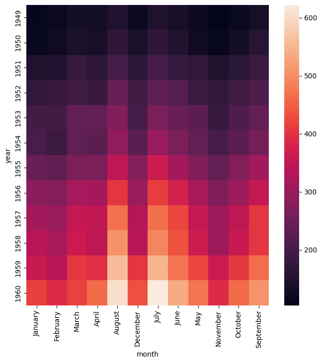
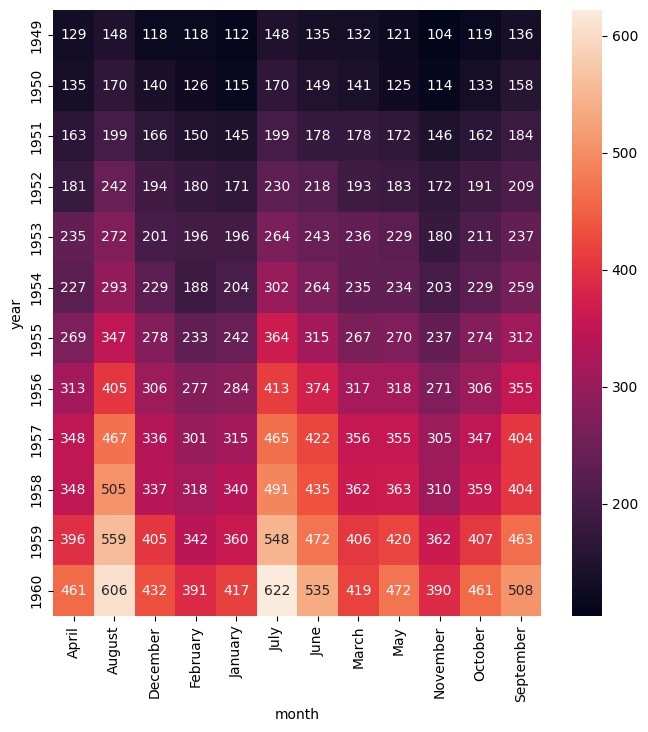
Simple example
Heatmap showing the number of passengers by month and year
in the flights.csv data set:
gurita heatmap -y year -x month -v passengers < flights.csv
The output of the above command is written to heatmap.month.year.png:
Getting help
The full set of command line arguments for heatmap plots can be obtained with the -h or --help
arguments:
gurita heatmap -h
Selecting columns to plot
-x COLUMN, --xaxis COLUMN
-y COLUMN, --yaxis COLUMN
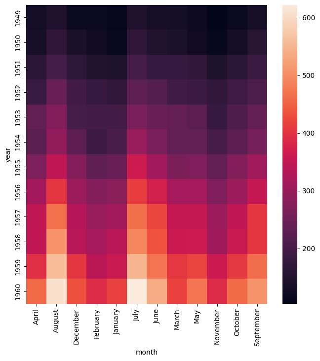
The X and Y axes of a heatmap must be categorical columns. The data must be formatted such that in each row the pair of values (X, Y) is unique (not repeated). If your data is not in this format it may be possible to transform it into this format using pivot.
The example below shows the same heatmap the simple example above but with the month on the Y axis and the year on the X axis:
gurita heatmap -y month -x year -v passengers < flights.csv
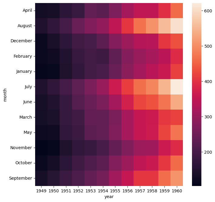
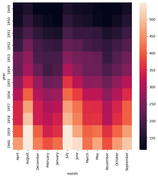
Colour map
--cmap COLOR_MAP_NAME
The colour map used in the heatmap can be set explicitly using --cmap with the name of the colour map as its argument.
Gurita uses Matlplotlib’s colour map names (because Gurita uses Seaborn to draw that heatmap, and Seaborn is built on top of Matplotlib).
The example below uses the YlOrRd (yellow-orange-red) colour map:
gurita heatmap -y year -x month -v passengers --cmap YlOrRd < flights.csv
Show the value as text in each cell
--annot [FORMAT]
The --annot option will display the numerical value as text in each cell of the heatmap. The optional argument FORMAT is a string that specifies how to display the numeric value as text.
The format string uses Python’s format specification language. It defaults to d which displays the value as
a decimal integer.
For real numbers (floating point) you may want to use a format like .2g which will display the number in scientific notation with 2 decimal places.
gurita heatmap -y year -x month -v passengers --annot < flights.csv
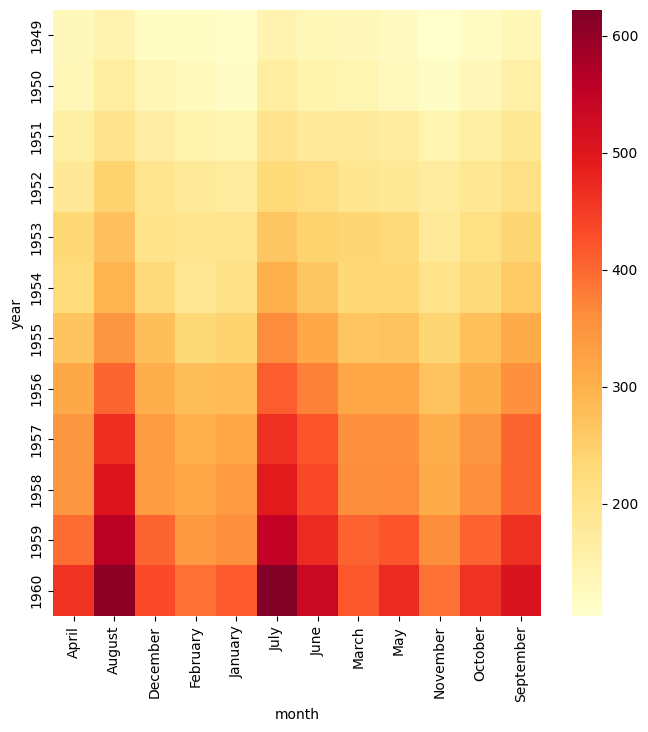
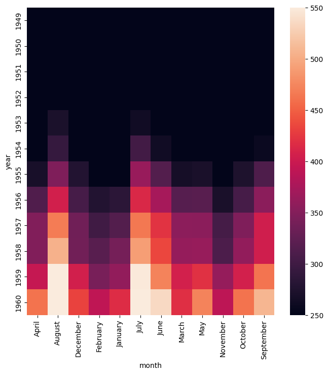
Control the range of values used in the colour map
--vmin NUM
--vmax NUM
--robust
The upper and lower bounds of the values displayed in the heatmap are chosen from the data by default, but they can be ajusted with --vmin and --vmax, setting the lower and upper bounds respectively.
It is possible to set one or both bounds at the same time.
In the example below the lower bound is set to 250 and the upper bound is set to 550. Values outside these bounds are clamped to the bounding values.
We observe that in this example data set it wasn’t until the early 1950s that the number of passengers per flight exceeded 250, hence the predominance of black cells in the top part of the plot.
gurita heatmap -y year -x month -v passengers --vmin 250 --vmax 550 < flights.csv
Alternatively, the --robust argument will cause the maximum and minimum values to be chosen based on quantiles, which can be desirable when extreme outliers occur in the data.
Note that --robust may not be used at the same time as --vmin and/or --vmax.
gurita heatmap -y year -x month -v passengers --robust < flights.csv
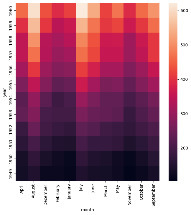
Control the order of the columns and rows
--sortx [{a,d}]]
--sorty [{a,d}]]
--orderx VALUE [VALUE]
--ordery VALUE [VALUE]
The default ordering of values on the X and Y axis is determined by their relative order in the input data. In many cases this is not the best order to display in the heatmap.
Therefore the order of the values on the axes can be either sorted, using --sortx and --sorty, or manually specified using --orderx and --ordery.
Both sort arguments accept an optional argument that specifies the direction of the sort: a for ascending and d for descending, where the order of rows is considered from top to bottom and the order of columns is considered
from left to right.
Categorical columns will be sorted alphabetically. Numerical columns will be sorted numerically.
If a specific order of values is required then this can be achived with --orderx and --ordery. Both of these arguments require one or more values to be specified, though it is possible to specify only a subset of all the possible
values. Any unlisted values will be ordered arbitrarily. This can be useful when the relative order of only a few values is important.
The example below generates a heatmap with the values on the Y axes displayed in descending sorted order:
gurita heatmap -y year -x month -v passengers --sorty d < flights.csv
The example below generates a heatmap with the first four values on the X axis shown in a specific order, namely: January, February, March, April. Note that the complete ordering of the twelve possible months is not specified. Thus the last eight months are shown in an arbitary order. If we wanted to specifiy the full order then the first eleven months would need to be specified.
gurita heatmap -y year -x month -v passengers --orderx January February March April < flights.csv