scatter
Scatter plots show the relationship between two columns as a scatter of data points.
Usage
gurita scatter [-h] [-x COLUMN] [-y COLUMN] ... other arguments ...
Arguments
Argument |
Description |
Reference |
|---|---|---|
|
display help |
|
|
select column for the X axis |
|
|
select column for the Y axis |
|
|
group columns by hue |
|
|
order of hue columns |
|
|
name of categorical column to use for plotted dot marker style |
|
|
scale the size of plotted dots based on a column |
|
|
size range for plotted point size |
|
|
alpha value for plotted points, default: 0.8 |
|
|
border line width value for plotted points |
|
|
border line colour plotted point |
|
|
log scale X axis |
|
|
log scale Y axis |
|
|
range limit X axis |
|
|
range limit Y axis |
|
|
column to use for facet rows |
|
|
column to use for facet columns |
|
|
wrap the facet column at this width, to span multiple rows |
See also
When one of the two columns being compared is a categorical value the scatter plot is similar to strip plot.
Scatter plots are based on Seaborn’s relplot library function, using the kind="scatter" option.
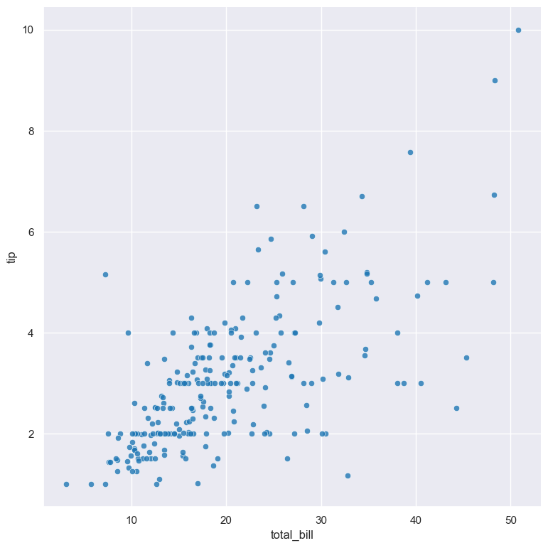
Simple example
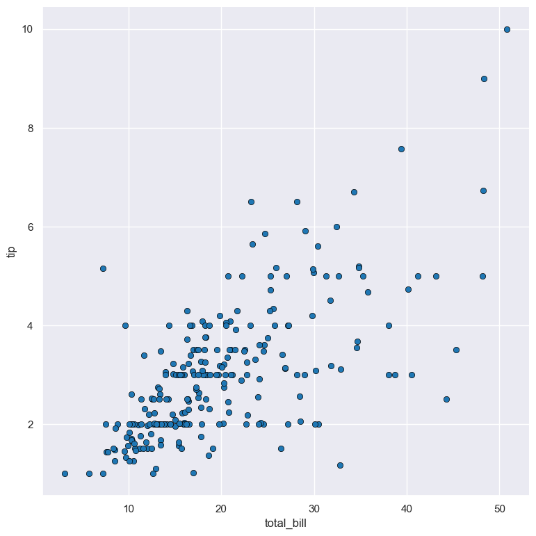
Scatter plot of the tip numerical column compared to the total_bill numerical column from the tips.csv input file:
gurita scatter -x total_bill -y tip < tips.csv
The output of the above command is written to scatter.total_bill.tip.png:
Getting help
The full set of command line arguments for scatter plots can be obtained with the -h or --help
arguments:
gurita scatter -h
Selecting columns to plot
-x COLUMN, --xaxis COLUMN
-y COLUMN, --yaxis COLUMN
Scatter plots can be plotted for two numerical columns as illustrated in the example above, one on each of the axes.
Scatter plots can also be used to compare a numerical column against a categorical column. In the example below, the numerical tip column is compared with the categorical day column in the tips.csv dataset:
gurita scatter -x day -y tip < tips.csv
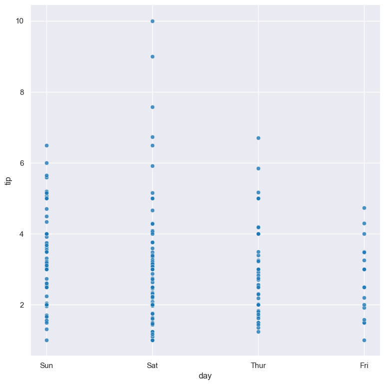
It should be noted that strip plots achieve a similar result as above, and may be preferable over scatter plots when comparing numerical and categorical data.
Swapping -x and -y in the above command would result in a horizontal plot instead of a vertical plot.
Colouring data points with hue
--hue COLUMN
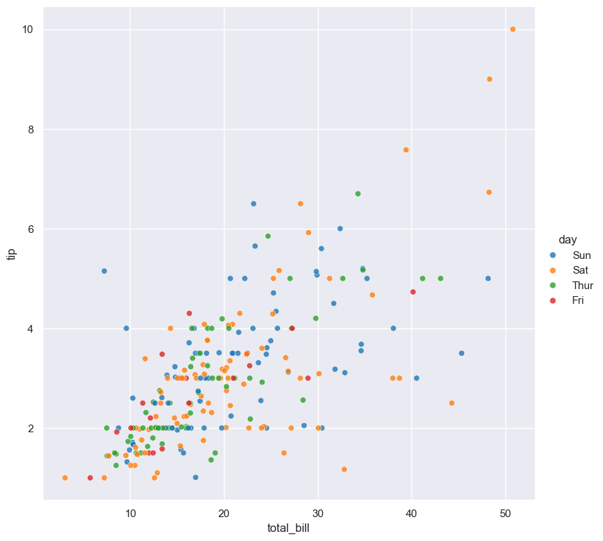
The data points can be coloured by an additional numerical or categorical column with the --hue argument.
In the following example the data points in a scatter plot comparing tip and total_bill are
coloured by their corresponding categorical day value:
gurita scatter -x total_bill -y tip --hue day < tips.csv
When the --hue paramter specifies a numerical column the colour scale is graduated.
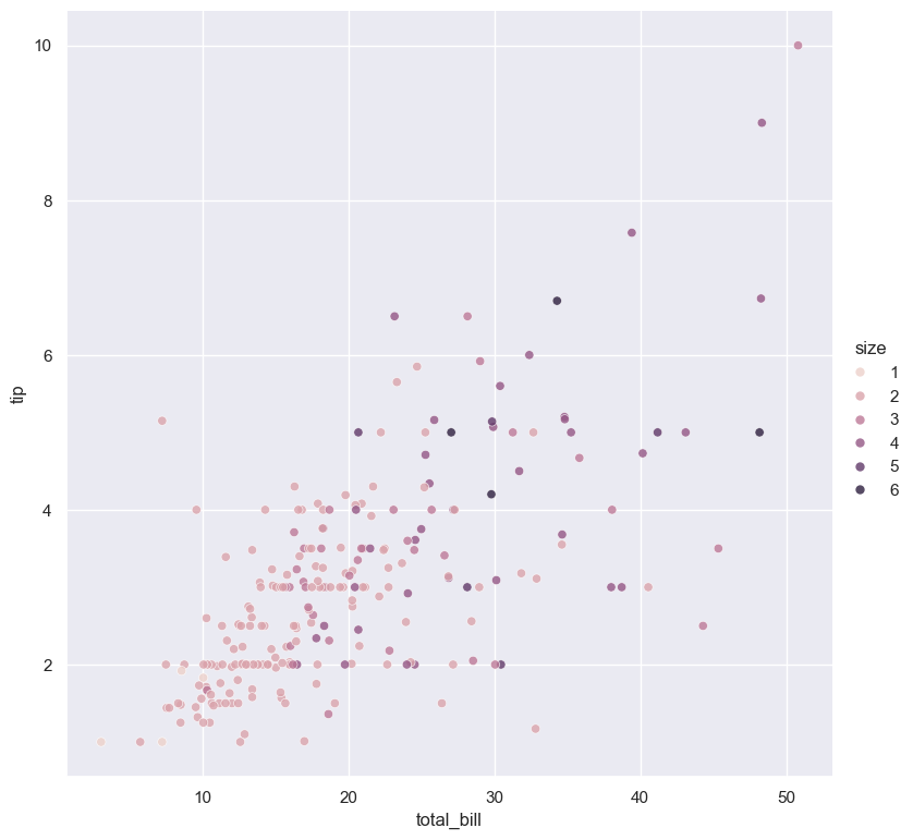
For example, in the following scatter plot the numerical size column is used for the --hue
argument:
gurita scatter -x total_bill -y tip --hue size < tips.csv
For categorical hue groups, the order displayed in the legend is determined from their occurrence in the input data. This can be overridden with the --hueorder argument, which allows you to specify the exact ordering of
the hue groups in the legend.
Dot style
--dotstyle COLUMN
By default dots in scatter plots are drawn as circles.
The --dotstyle argument lets you change the shape of dots based on a categorical column.
gurita scatter -x total_bill -y tip --hue day --dotstyle sex < tips.csv
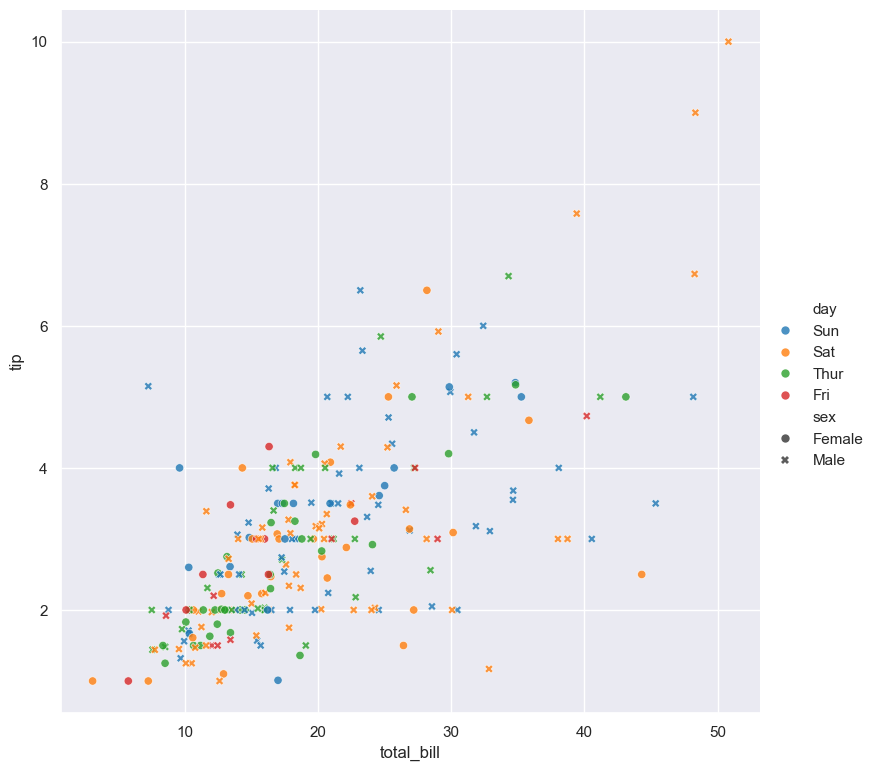
In the above example the hue of dots is determined by the day column and the dot marker style is determined by the sex column. In this case male dots use a cross marker and female dots use a circle marker.
It is acceptable for both the --hue and --dotstyle arguments to be based on the same (categorical) column in the data set. In such cases both the colour and marker shape will vary with
the underlying column.
Dot size
--dotsize COLUMN
--dotsizerange LOW HIGH
The size of plotted dots in the scatter plot can be scaled according the a numerical column with the --dotsize argument.
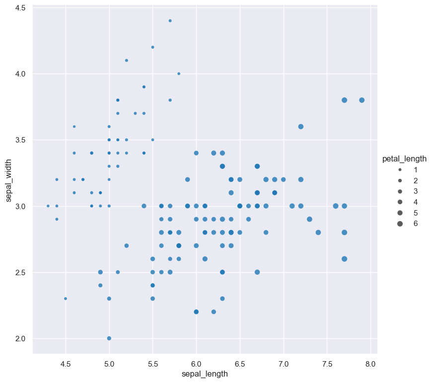
The following example generates a scatter plot comparing sepal_length to sepal_width using the iris.csv dataset. The size of dots in the
plot is scaled according to the petal_length column.
gurita scatter -x sepal_length -y sepal_width --dotsize petal_length < iris.csv
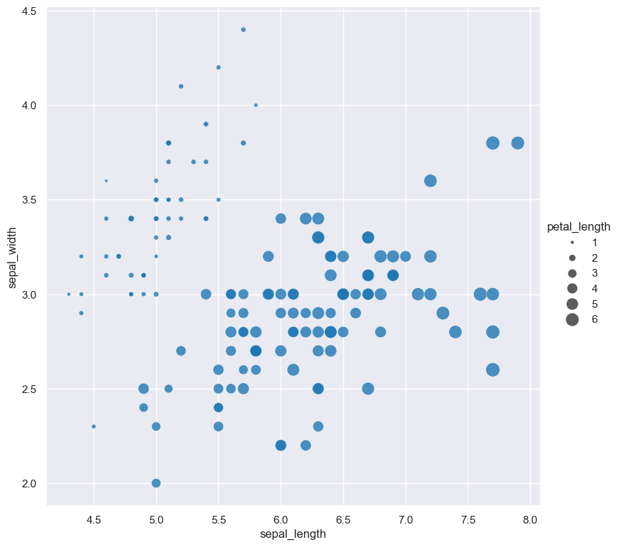
The range of dot sizes can be adjusted with --dotsizerange LOW HIGH.
gurita scatter -x sepal_length -y sepal_width --dotsize petal_length --dotsizerange 10 200 < iris.csv
Dot transparency, border line width, border line colour
--dotalpha ALPHA
--dotlinewidth WIDTH
--dotlinecolour COLOUR
The transparency of dots is defined by the dot alpha value, which is a number ranging from 0 to 1, where 0 is fully transparent and 1 is fully opaque.
By default the alpha transparency value of scatter plot dots is 0.8. This can be
overridden with --dotalpha.
Dots are plotted with a thin white border by default. The border line width can be changed with --dotlinewidth and the border line colour can
be changed with --dotlinecolour.
In the following example, the dot alpha is set to 1 (fully opaque), the border line width is set to 0.5, and the border line colour is set to black.
gurita scatter -x total_bill -y tip --dotalpha 1 --dotlinewidth 0.5 --dotlinecolour black < tips.csv
Log scale
--logx
--logy
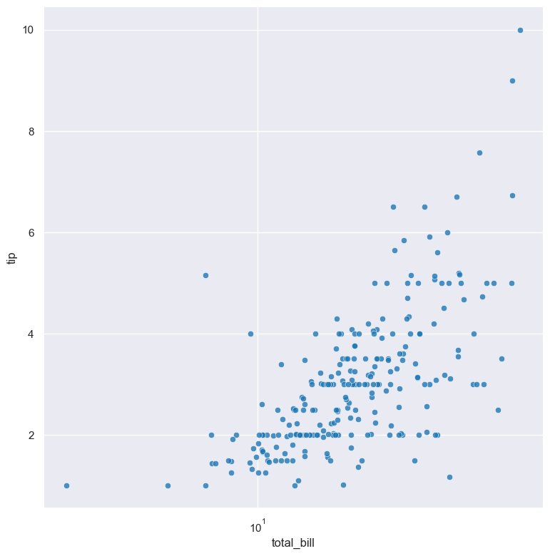
The distribution of numerical values can be displayed in log (base 10) scale with --logx and --logy.
For example the following command produces a scatter plot comparing total_bill with tip, such that total_bill on the X axis is plotted in log scale:
gurita scatter -x total_bill -y tip --logx < tips.csv
Axis range limits
--xlim LOW HIGH
--ylim LOW HIGH
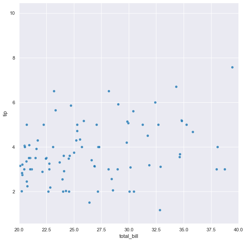
The range of displayed numerical distributions can be restricted with --xlim and --ylim. Each of these flags takes two numerical values as arguments that represent the lower and upper bounds of the (inclusive) range to be displayed.
For example the following command produces a scatter plot comparing total_bill with tip, such that the range of total_bill on the X axis is limited to values between 20 and 40 inclusive:
gurita scatter -x total_bill -y tip --xlim 20 40 < tips.csv
Facets
--frow COLUMN
--fcol COLUMN
--fcolwrap INT
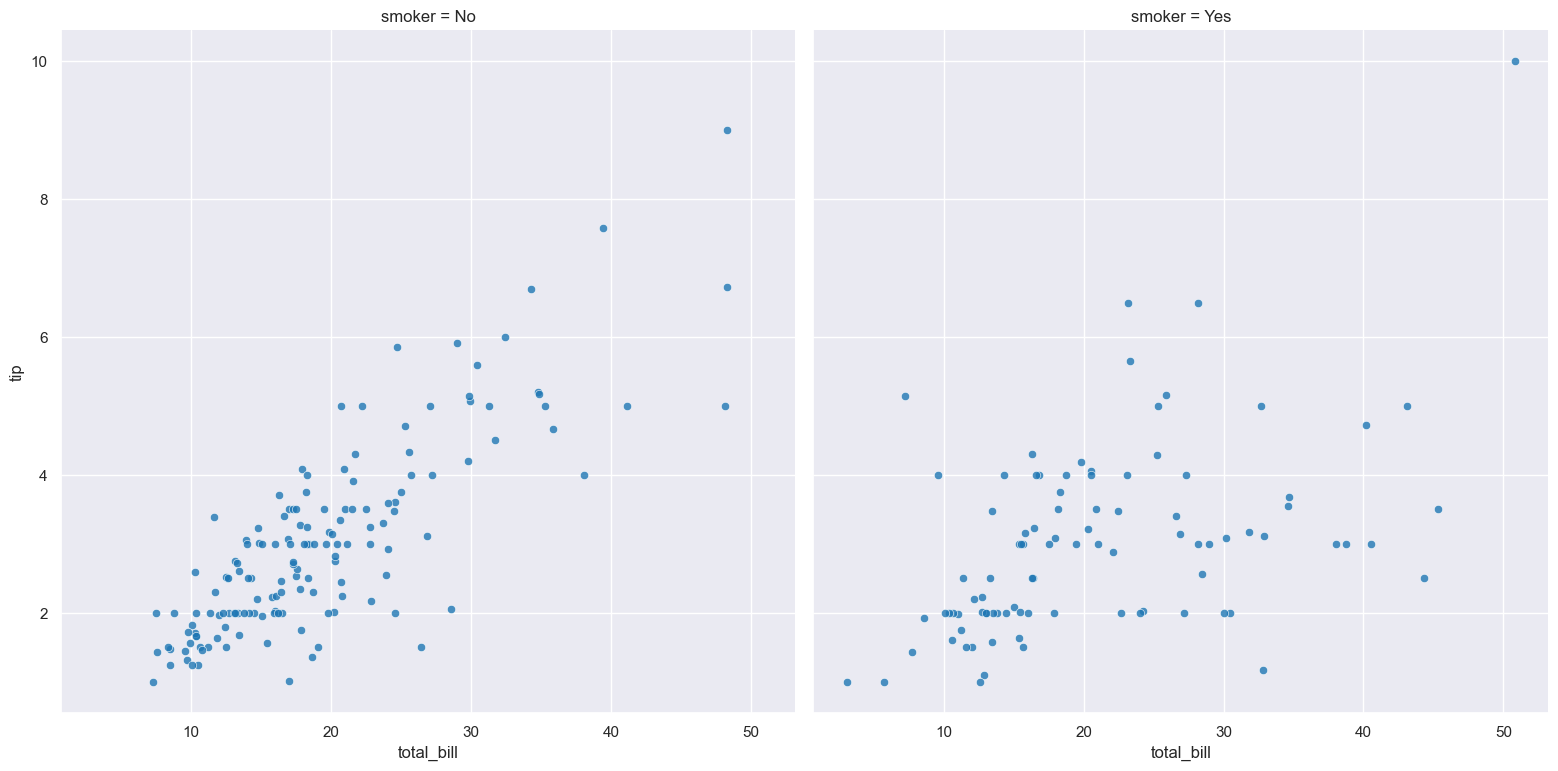
Scatter plots can be further divided into facets, generating a matrix of scatter plots, where a numerical value is further categorised by up to 2 more categorical columns.
See the facet documentation for more information on this feature.
For example the following command produces a scatter plot comparing total_bill with tip, such that facet column is determined by the value of the smoker column.
gurita scatter -x total_bill -y tip --fcol smoker < tips.csv