pair
Plot relationships between pairs of columns on a grid of axes.
By default comparisons are made between all numerical columns in the data, however it is possible to specify which columns to compare, including categorical columns as well.
A histogram showing the distribution of each column is shown on the diagonal.
Usage
gurita pair [-h] [-c [COLUMN ...]] [--kind {scatter,kde,hist,reg}] ... other arguments ...
Arguments
Argument |
Description |
Reference |
|---|---|---|
|
display help for this command |
|
|
select columns to compare |
|
|
group data by a categorical column |
|
|
only plot the lower left corner of the grid |
|
|
choose the kind of plot (default: |
See also
Pair plots are based on Seaborn’s pairplot library function.
Simple example
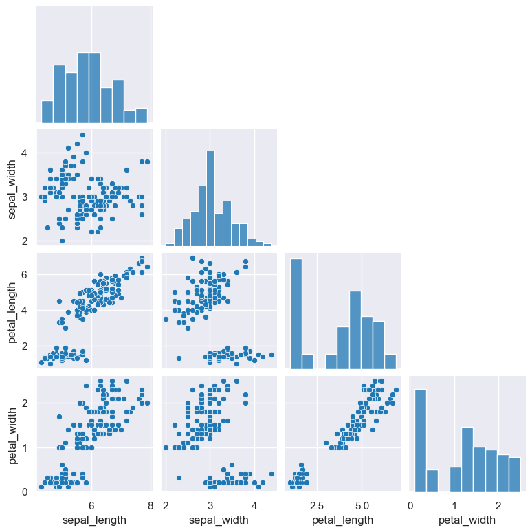
The following example generates a pair plot comparing all the numerical columns in the iris.csv data set.
Note that there are four numerical columns in this data set (sepal_width, sepal_length, petal_length, petal_width) and one categorical column (species).
By default, if no column names are specified in a pair plot, all the numerical columns will be compared (and catergorical columns are ignored).
This behaviour can be overridden with the -c, --col argument.
gurita pair < iris.csv
The output of the above command is written to pair.png:
Getting help
The full set of command line arguments for pair plots can be obtained with the -h or --help
arguments:
gurita pair -h
Selecting columns to compare
-c [COLUMN ...], --col [COLUMN ...]
By default, if no column names are specified in a pair plot, all the numerical columns will be compared (and catergorical columns are ignored).
This behaviour can be overridden with the -c (or --col) argument.
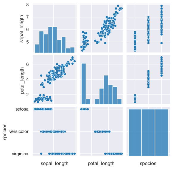
The following example generates a pair plot comparing the sepal_length, petal_length, and species columns. Note that species is
a categorical column, and it would not be plotted by default.
gurita pair -c sepal_length petal_length species < iris.csv
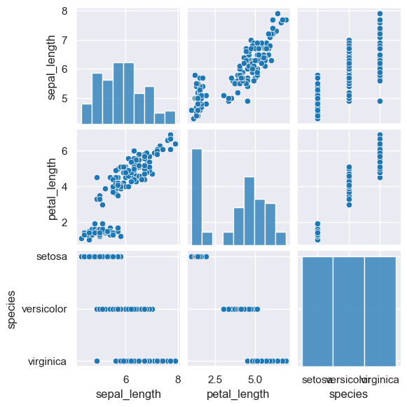
Unfortunately, due to the small size of the above plot, the axes labels for species on the X axis overlap one another. This can be avoided
by rotating the X axis tick labels by 90 degrees using --rxtl 90:
gurita pair -c sepal_length petal_length species --rxtl 90 < iris.csv
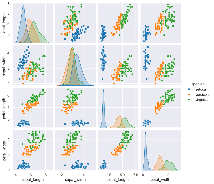
Group data by a categorical column with hue
--hue COLUMN
The plotted data can be grouped by a categorical column, where each group is rendered as a different colour.
In the example below, no column names are specified, so only the numerical columns are plotted.
gurita pair --hue species < iris.csv
Only plot the lower left corner of the grid
--corner
By default a pair plot shows a full square grid of plots for each pairwise comparison. In this sense the top right and bottom left triangles
of the plot are reflected mirror images. An alternative is to plot only the bottom left corner of the grid using the --corner argument.
gurita pair --corner < iris.csv
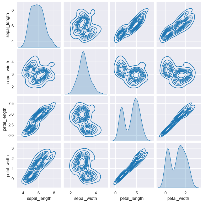
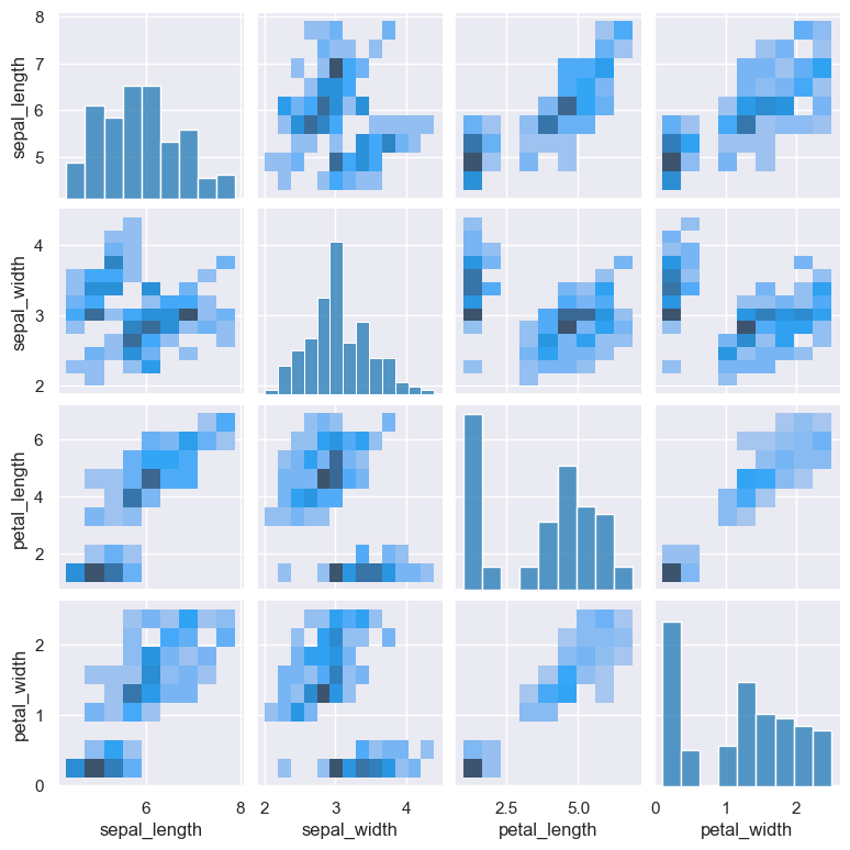
Choose the kind of plot
--kind {scatter,kde,hist,reg}
By default pair plots use a scatter plot to compare two numerical columns. This can be changed with the --kind argument, which allows you to choose
from four plot types:
scatter(the default)kdekernel density estimatehisthistogramregregression
The example below shows a pair plot using kde (kernel density estimate) as the method of comparison:
gurita pair --kind kde < iris.csv
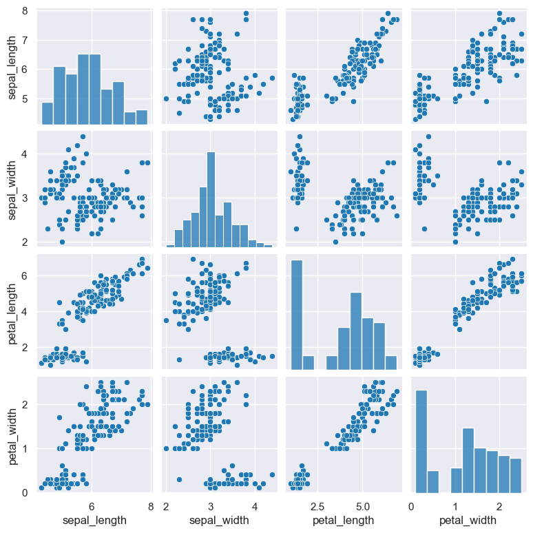
The example below shows a pair plot using hist (histogram) as the method of comparison:
gurita pair --kind hist < iris.csv
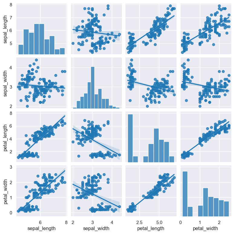
The example below shows a pair plot using reg (regression) as the method of comparison:
gurita pair --kind reg < iris.csv