count
Count plots show the frequency of values within categorical columns using bars.
Usage
gurita count [-h] [-x COLUMN] [-y COLUMN] ... other arguments ...
Arguments
Argument |
Description |
Reference |
|---|---|---|
|
display help |
|
|
select column for the X axis |
|
|
select column for the Y axis |
|
|
order of the plotted columns |
|
|
colour and/or group columns by hue |
|
|
order of hue columns |
|
|
log scale X axis |
|
|
log scale Y axis |
|
|
range limit X axis |
|
|
range limit Y axis |
|
|
column to use for facet rows |
|
|
column to use for facet columns |
|
|
wrap the facet column at this width, to span multiple rows |
See also
Count plots are based on Seaborn’s catplot library function, using the kind="count" option.
Simple example
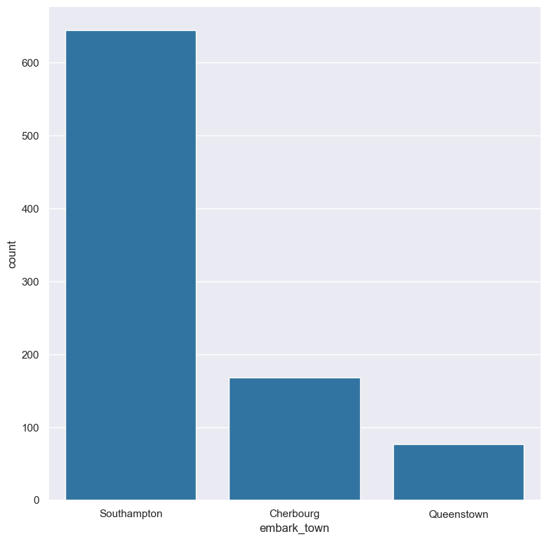
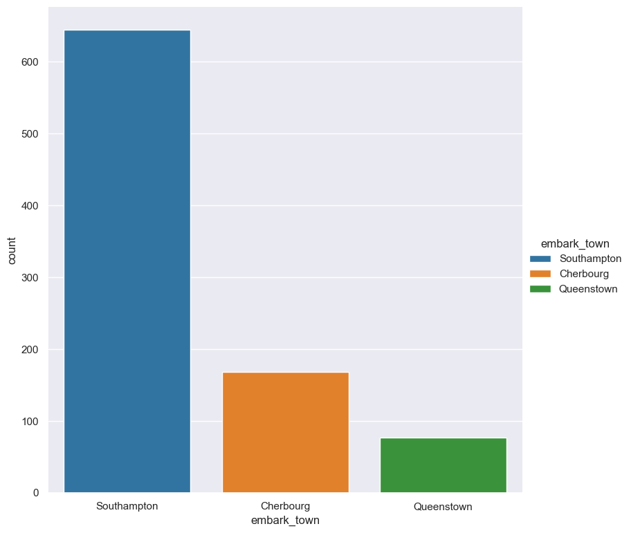
Plot a count of the embark_town categorical column from the titanic.csv input file:
gurita count -x embark_town < titanic.csv
The output of the above command is written to count.embark_town.png:
Getting help
The full set of command line arguments for count plots can be obtained with the -h or --help
arguments:
gurita count -h
Selecting columns to plot
-x COLUMN, --xaxis COLUMN
-y COLUMN, --yaxis COLUMN
Count plots can be plotted for categorical columns.
Note
If a numerical column is selected for a count plot it will be treated as categorical, which may not give expected behaviour.
You may not use both -x COLUMN and -y COLUMN in the same command line for count plots.
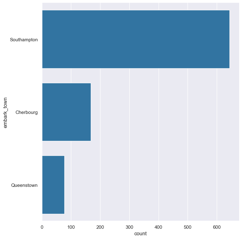
You can select the column that you want to plot as a count using the -x (--xaxis) or -y (--yaxis)
arguments.
If -x (--xaxis) is chosen the count columns will be plotted vertically.
If -y (--yaxis) is chosen the count columns will be plotted horizontally.
See the example above for a vertical axis plot.
For comparison, the following command uses -y embark_town to plot a histogram of embark_town horizontally:
gurita count -y embark_town < titanic.csv
Controlling the order of the bars
--order VALUE [VALUE ...]
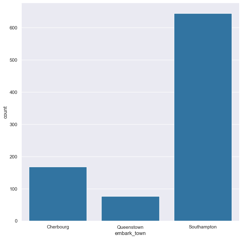
By default the order of the categorical columns displayed in the count plot is determined from their occurrence in the input data.
This can be overridden with the --order argument, which allows you to specify the exact ordering of columns based on their values.
In the following example the counts of the embark_town column are displayed in the order of Cherbourg, Queenstown, Southampton:
gurita count -x embark_town --order Cherbourg Queenstown Southampton < titanic.csv
Grouping columns with hue
--hue COLUMN
The column being counted can be coloured and/or grouped based on another categorical column using the --hue argument.
In the following example the counts of the embark_town are coloured separately:
gurita count -x embark_town --hue embark_town < titanic.csv
In the following example the counts of the embark_town column are grouped by the class column from the titanic data set:
gurita count -x embark_town --hue class < titanic.csv
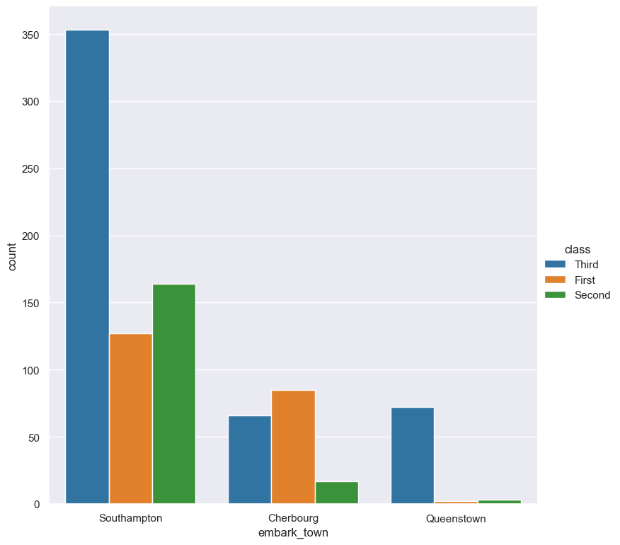
By default the order of the columns within each hue group is determined from their occurrence in the input data.
This can be overridden with the --hueorder argument, which allows you to specify the exact ordering of columns within each hue group, based on their values.
In the following example the class values are displayed in the order of First, Second, Third:
gurita count -x embark_town --hue class --hueorder First Second Third < titanic.csv
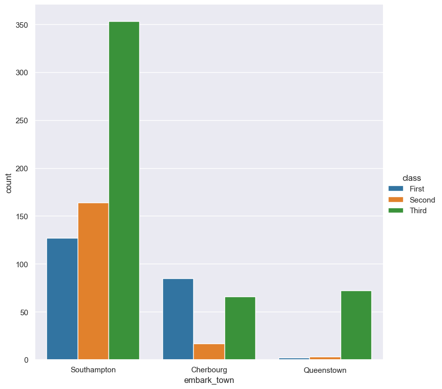
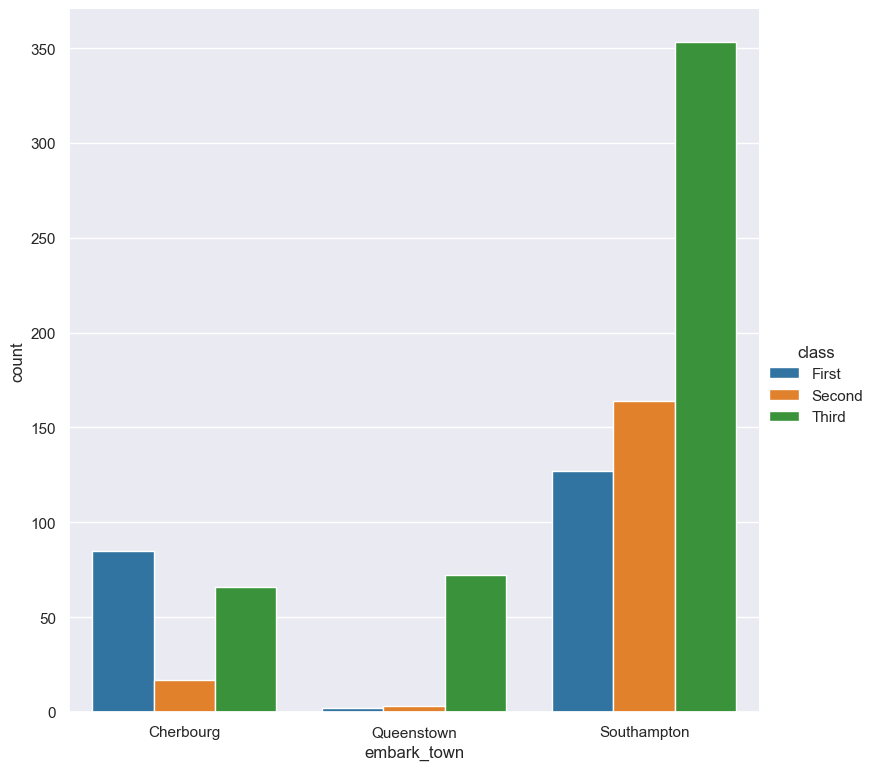
It is possible to use both --order and --hueorder in the same command. For example, the following command controls the order of both
the embark_town and class categorical columns:
gurita count -x embark_town --hue class --order Cherbourg Queenstown Southampton \
            --hueorder First Second Third < titanic.csv
Log scale
--logx
--logy
Count values can be displayed in log (base 10) scale with --logx and --logy.
It only makes sense to log-scale the count axis (and not the categorical axis). Therefore, --logx should be used when categorical columns are selected with -y, and
conversely, --logy should be used when categorical columns are selected with -x.
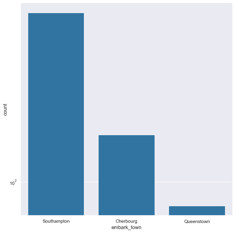
For example, you can display a log scale of counts for the embark_town column (when the column is displayed on the X-axis) like so. Note carefully that the categorical
data is displayed on the X-axis (-x), therefore the --logy argument should be used to log-scale the counts:
gurita count -x embark_town --logy < titanic.csv
Axis range limits
--xlim LOW HIGH
--ylim LOW HIGH
The range of displayed count values can be restricted with --xlim and --ylim. Each of these flags takes two numerical values as arguments that represent the lower and upper bounds of values to be displayed.
It only makes sense to range-limit the count axis (and not the categorical axis). Therefore, --xlim should be used when categorical columns are selected with -y, and
conversely, --ylim should be used when categorical columns are selected with -x.
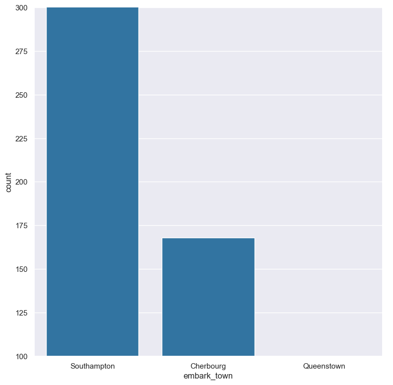
For example, you can display range-limited count for the embark_town column (when the column is displayed on the X-axis) like so. Note carefully that the categorical
data is displayed on the X-axis (-x), therefore the --ylim argument should be used to range-limit the counts:
gurita count -x embark_town --ylim 100 300 < titanic.csv
Facets
--frow COLUMN
--fcol COLUMN
--fcolwrap INT
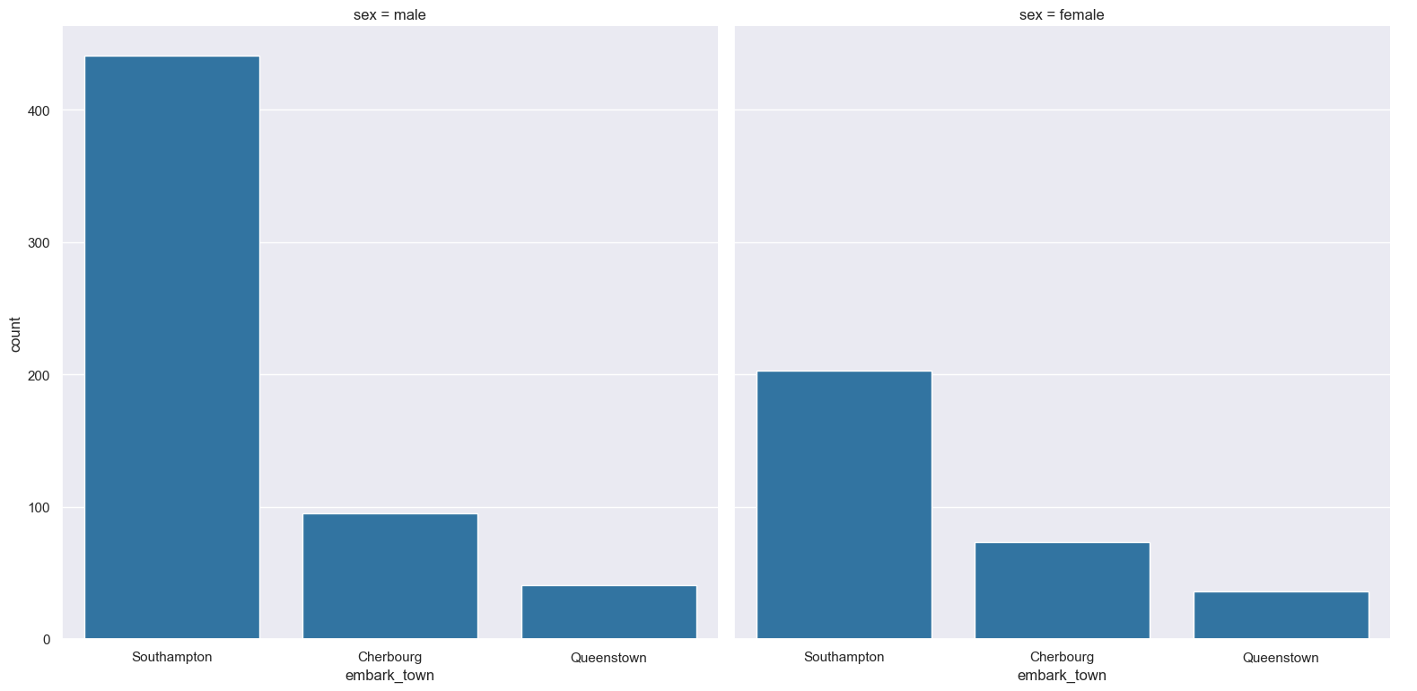
Count plots can be further divided into facets, generating a matrix of count plots.
See the facet documentation for more information on this feature.
The follow command creates a faceted bar plot where the sex column is used to determine the facet columns:
gurita count -x embark_town --fcol sex < titanic.csv