line
Line plots show the relationship between two numerical columns, optionally grouped by categorical columns.
If multiple Y values are provided for each X value then the plot will show an estimate of the central tendency of X and confidence interval for the estimate.
Usage
gurita line [-h] [-x COLUMN] [-y COLUMN] ... other arguments ...
Arguments
Argument |
Description |
Reference |
|---|---|---|
|
display help |
|
|
select column for the X axis |
|
|
select column for the Y axis |
|
|
group columns by hue |
|
|
order of hue columns |
|
|
log scale X axis |
|
|
log scale Y axis |
|
|
range limit X axis |
|
|
range limit Y axis |
|
|
column to use for facet rows |
|
|
column to use for facet columns |
|
|
wrap the facet column at this width, to span multiple rows |
See also
Line plots are based on Seaborn’s relplot library function, using the kind="line" option.
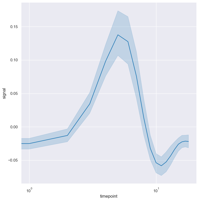
Simple example
A line plot showing the relationship between timepoint on the X axis and signal on the Y axis for the fmri.csv dataset:
gurita line -x timepoint -y signal < fmri.csv
The output of the above command is written to line.timepoint.signal.png.
Getting help
The full set of command line arguments for line plots can be obtained with the -h or --help
arguments:
gurita line -h
Selecting columns to plot
-x COLUMN, --xaxis COLUMN
-y COLUMN, --yaxis COLUMN
Line plots show an indepdent numerical column on the X axis and a depdendent numerical column on the Y axis.
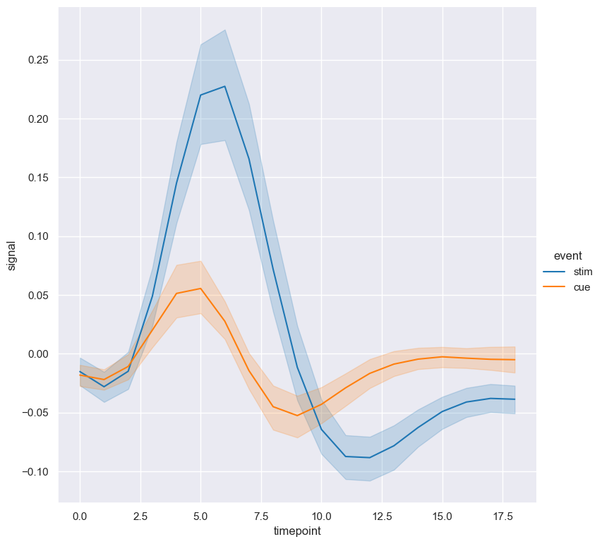
Grouping columns with hue
--hue COLUMN
The data can be grouped by a categorical column with the --hue argument.
In the following example signal is plotted against timepoint for the two different classes of the event column in the fmri.csv dataset:
gurita line -x timepoint -y signal --hue event < fmri.csv
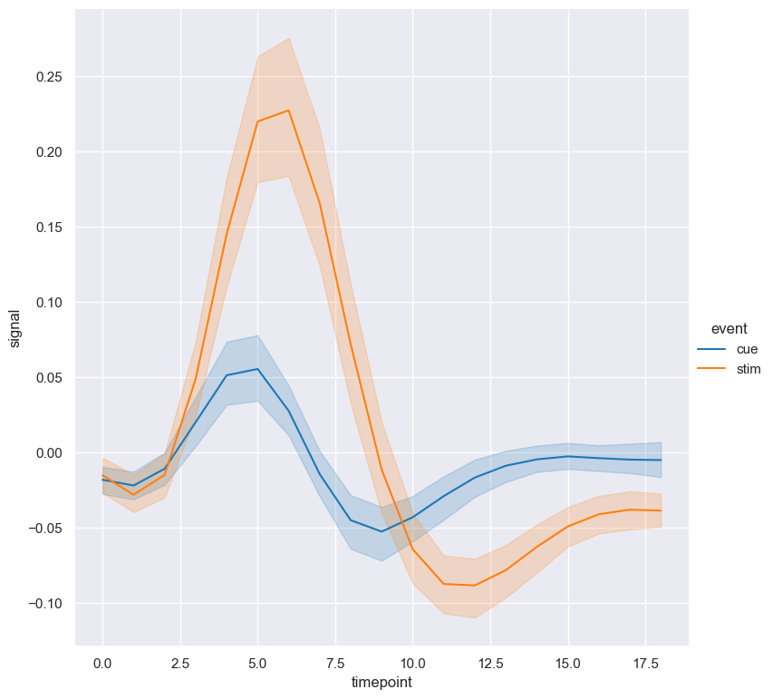
By default the order of the columns within each hue group is determined from their occurrence in the input data.
This can be overridden with the --hueorder argument, which allows you to specify the exact ordering of columns within each hue group, based on their values.
In the following example the classes of event are displayed in the order cue, stim:
gurita line -x timepoint -y signal --hue event --hueorder cue stim < fmri.csv
Log scale
--logx
--logy
The distribution of numerical values can be displayed in log (base 10) scale with --logx and --logy.
It only makes sense to log-scale the numerical axis (and not the categorical axis). Therefore, --logx should be used when numerical columns are selected with -x, and
conversely, --logy should be used when numerical columns are selected with -y.
For example, the X axis can be plotted in log scale like so:
gurita line -x timepoint -y signal --logx < fmri.csv
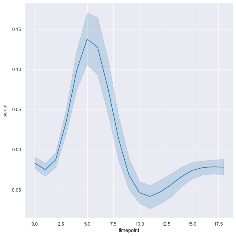
Axis range limits
--xlim LOW HIGH
--ylim LOW HIGH
The range of displayed numerical distributions can be restricted with --xlim and --ylim. Each of these flags takes two numerical values as arguments that represent the lower and upper bounds of the range to be displayed.
It only makes sense to range-limit the numerical axis (and not the categorical axis). Therefore, --xlim should be used when numerical columns are selected with -x, and
conversely, --ylim should be used when numerical columns are selected with -y.
For example, you can display range-limited range for the timepoint column like so:
gurita line -x timepoint -y signal --xlim 5 15.5 < fmri.csv
![Line plot where signal is plotted against timepoint with the X axis range limited to [5, 15.5]](_images/line.timepoint.signal.xlim.png)
Facets
--frow COLUMN
--fcol COLUMN
--fcolwrap INT
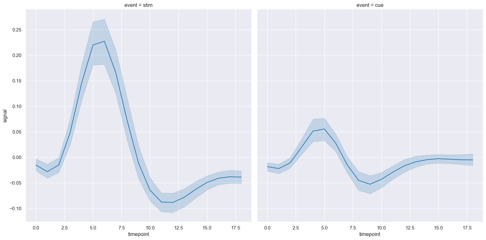
Line plots can be further divided into facets, generating a matrix of line plots, where a numerical value is further categorised by up to 2 more categorical columns.
See the facet documentation for more information on this feature.
The following command creates a faceted line plot where the event column is used to determine the facet columns:
gurita line -x timepoint -y signal --fcol event < fmri.csv