hist (histogram)
Plot distributions of selected numerical or categorical columns as histograms.
Usage
gurita hist [-h] [-x COLUMN] [-y COLUMN] ... other arguments ...
Arguments
Argument |
Description |
Reference |
|---|---|---|
|
display help |
|
|
select column for the X axis |
|
|
select column for the Y axis |
|
|
number of bins |
|
|
width of bins, overrides |
|
|
plot a cumulative histogram |
|
|
group columns by hue |
|
|
Statistic to use for each bin (default: count) |
|
|
normalise each histogram in the plot independently |
|
|
overlay a kernel density estimate (kde) as a line |
|
|
use unfilled histogram bars instead of solid coloured bars |
|
|
style of histogram bars (default is bars) |
|
|
log scale X axis |
|
|
log scale Y axis |
|
|
range limit X axis |
|
|
range limit Y axis |
|
|
column to use for facet rows |
|
|
column to use for facet columns |
|
|
wrap the facet column at this width, to span multiple rows |
See also
Histograms are based on Seaborn’s displot library function, using the kind="hist" option.
Simple examples
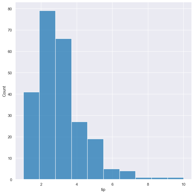
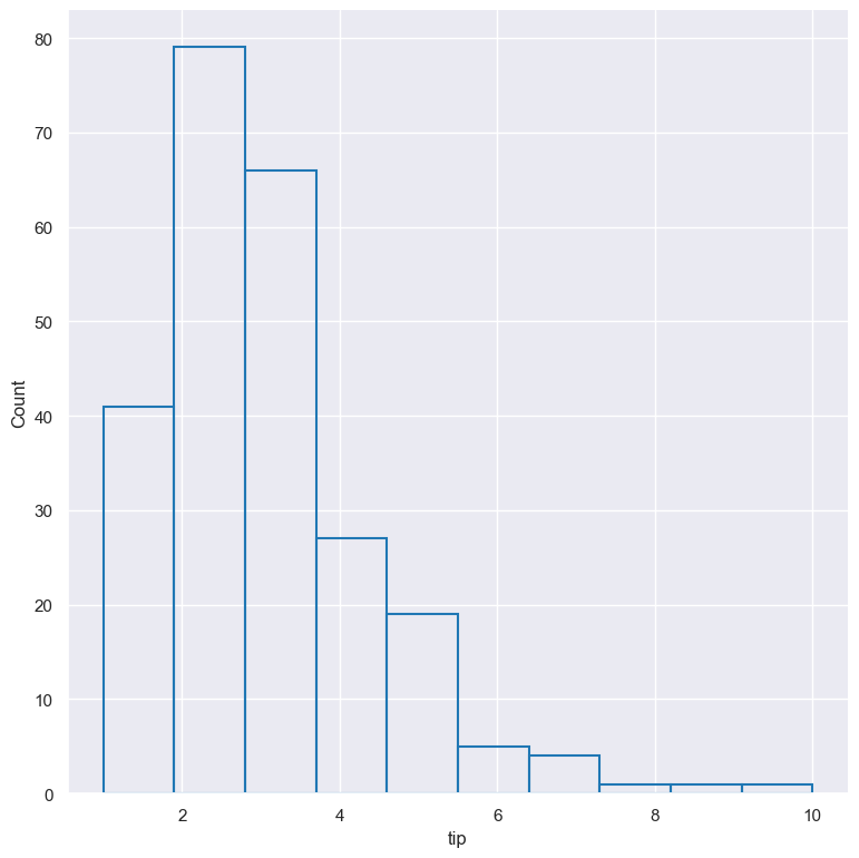
Plot a histogram of the tip amount from the tips.csv input file:
gurita hist -x tip < tips.csv
The output of the above command is written to hist.tip.png:
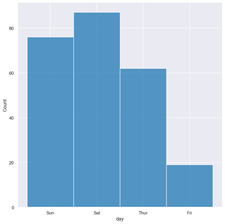
Plot a count of the different categorical values in the day column:
gurita hist -x day < tips.csv
The output of the above command is written to hist.day.png:
Getting help
The full set of command line arguments for histograms can be obtained with the -h or --help
arguments:
gurita hist -h
Selecting columns to plot
-x COLUMN, --xaxis COLUMN
                      Feature to plot along the X axis
-y COLUMN, --yaxis COLUMN
                      Feature to plot along the Y axis
Histograms can be plotted for both numerical columns and for categorical columns. Numerical data is binned and the histogram shows the counts of data points per bin. Catergorical data is shown as a count plot with a column for each categorical value in the specified column.
You can select the column that you want to plot as a histogram using the -x/--xaxis or -y/--yaxis arguments.
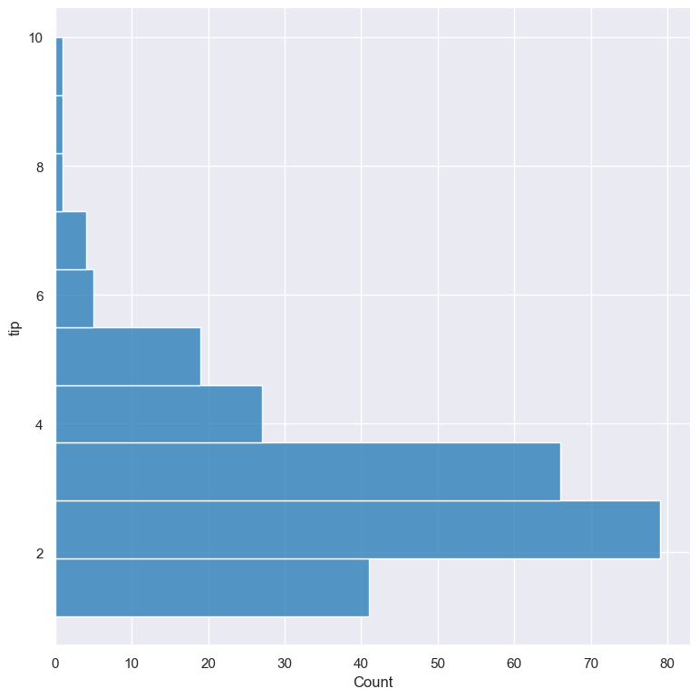
If -x is chosen the histogram columns will be plotted vertically.
If -y is chosen the histogram columns will be plotted horizontally.
If both -x and -y are both specified then a heatmap will be plotted.
See the example above for a vertical axis plot.
For comparison, the following command uses -y tip to plot a histogram of tip horizontally:
gurita hist -y tip < tips.csv
Histogram of two columns (bivariate heatmaps)
Bivariate histograms (two columns) can be plotted by specifying both -x and -y.
In the following example the distribution of tip is compared to the distribution of total_bill. The result is shown as a heatmap:
gurita hist -x tip -y total_bill < tips.csv
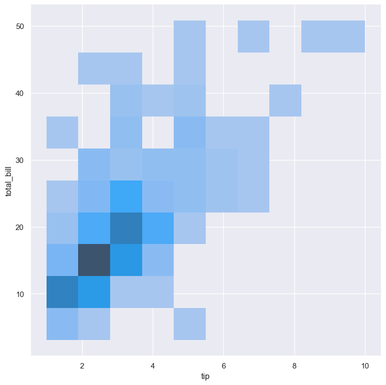
Bivariate histograms also work with categorical variables and combinations of numerical and categorical variables.
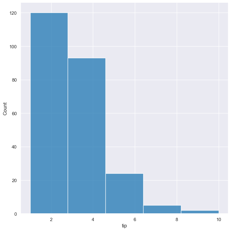
Number of bins
For numerical columns, by default gurita will try to automatically pick an appropriate number of bins for the selected column.
However, this can be overridden by specifying the required number of bins to use with the --bins
argument like so:
gurita hist -x tip --bins 5 < tips.csv
Width of bins
For numerical columns, by default gurita will try to automatically pick an appropriate bin width for the selected column.
However, this can be overridden by specifying the required bin width to use with the --binwidth
argument like so:
gurita hist -x tip --binwidth 3 < tips.csv
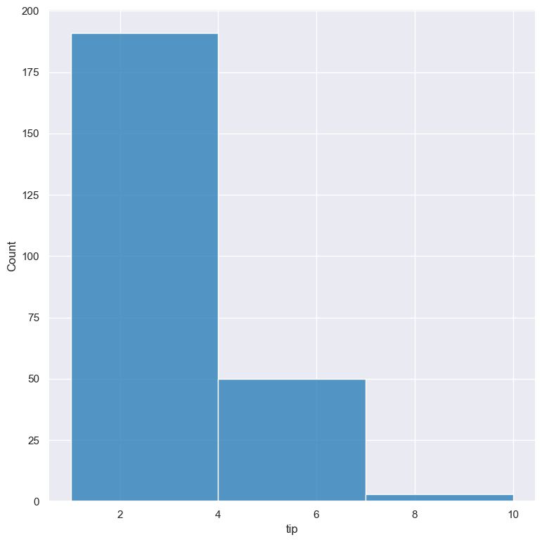
Note that --binwidth overrides the --bins parameter.
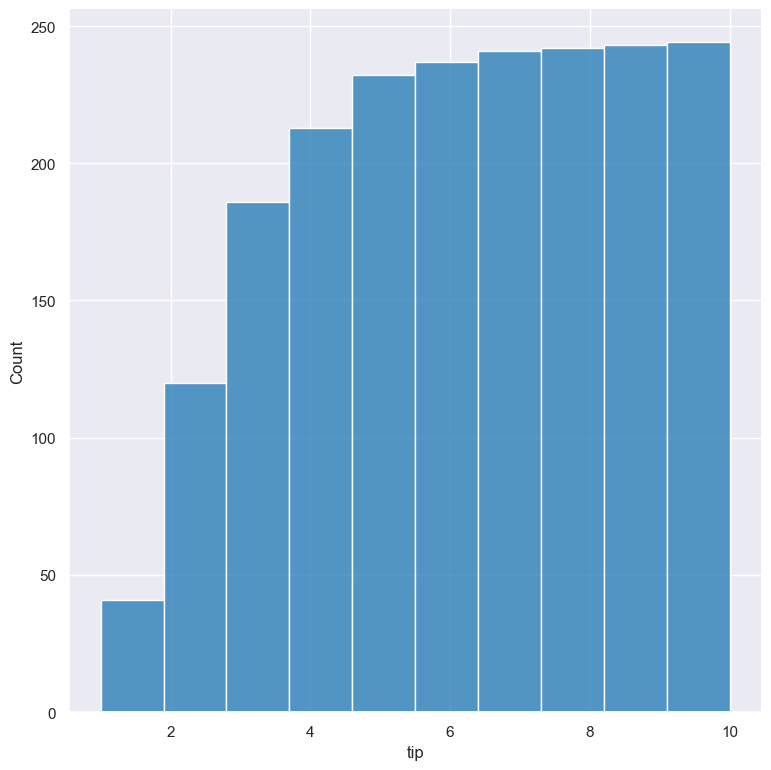
Cumulative histograms
Cumulative histograms can be plotted with the --cumulative argument.
gurita hist -x tip --cumulative < tips.csv
Show distributions of categorical subsets using hue
--hue COLUMN
The distribution of categorical subsets of the data can be shown with the --hue argument.
In the following example the distribution of distribution of the tip column
is divided into two subsets based on the categorical smoker column. Each
subset is plotted as its own histogram, layered on top of each other:
gurita hist -x tip --hue smoker < tips.csv
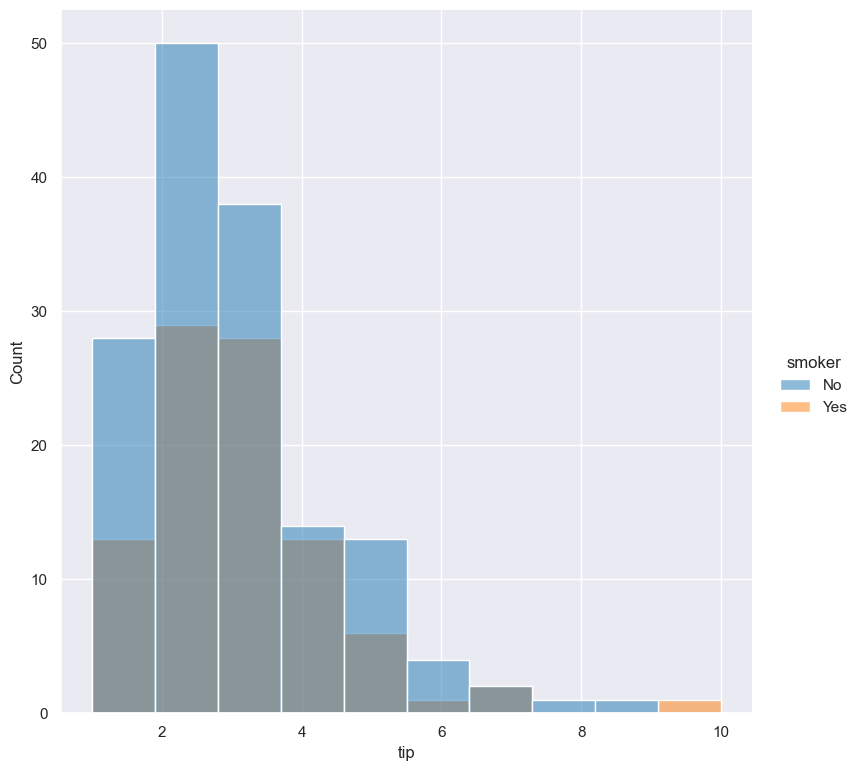
The default behaviour is to layer overlapping histograms on top of each other, as demonstrated in the above plot.
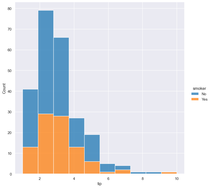
The --multiple parameter lets you choose alternative ways to show overlapping histograms. The example below shows the
two histograms stacked on top of each other:
gurita hist -x tip --hue smoker --multiple stack < tips.csv
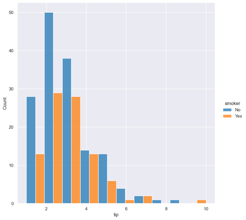
The --multiple paramter supports the following values: layer (default), stack, dodge, and fill.
The following example shows the effect of --multiple dodge, where categorical fields are shown next to each other:
gurita hist -x tip --hue smoker --multiple dodge < tips.csv
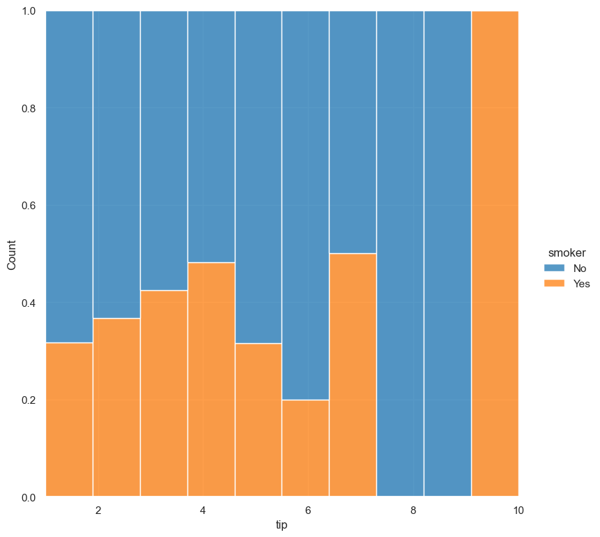
The following example shows the effect of --multiple fill, where counts are normalised to a proportion, and bars are filled so that all categories sum to 1:
gurita hist -x tip --hue smoker --multiple fill < tips.csv
Histogram statistic
By default histograms show a count of the number of values in each bin. However this can be changed with the --stat {count,frequency,probability,proportion,percent,density}
argument
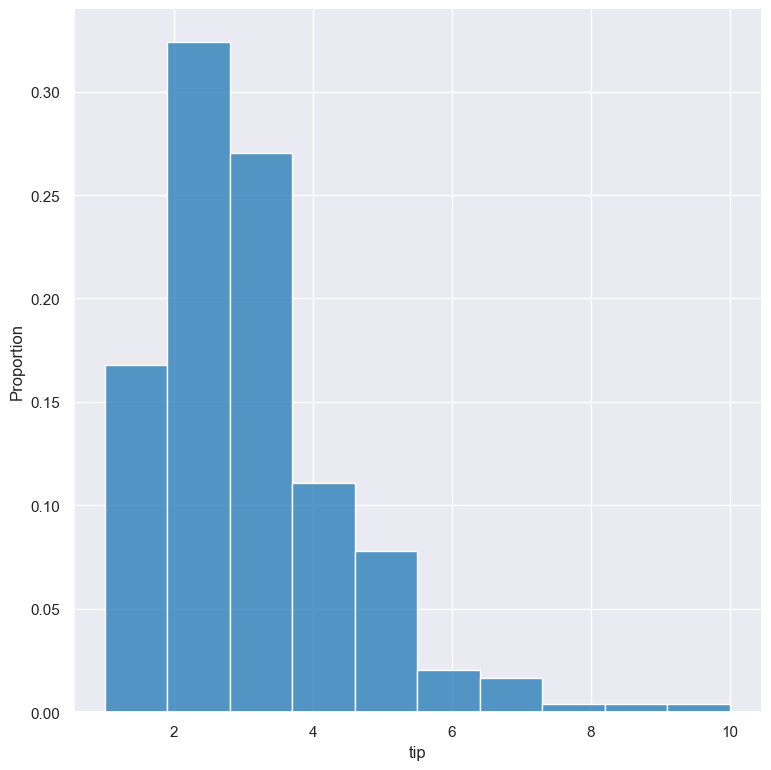
gurita hist -x tip --stat proportion < tips.csv
Independent normalised statistics
The --stat argument allows the use of the following normalising statistics:
probability
proportion (same as probability)
percent
density
In plots with mutliple histograms for categorical subsets using --hue, by default these statistics are normalised across the entire dataset.
This behaviour can be changed by --indnorm such that the normalisation happens within each categorical subset.
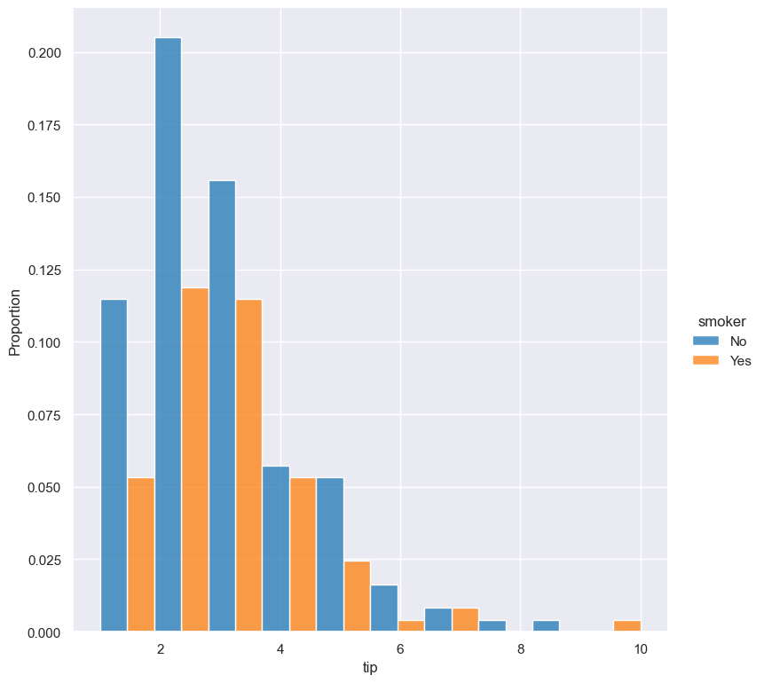
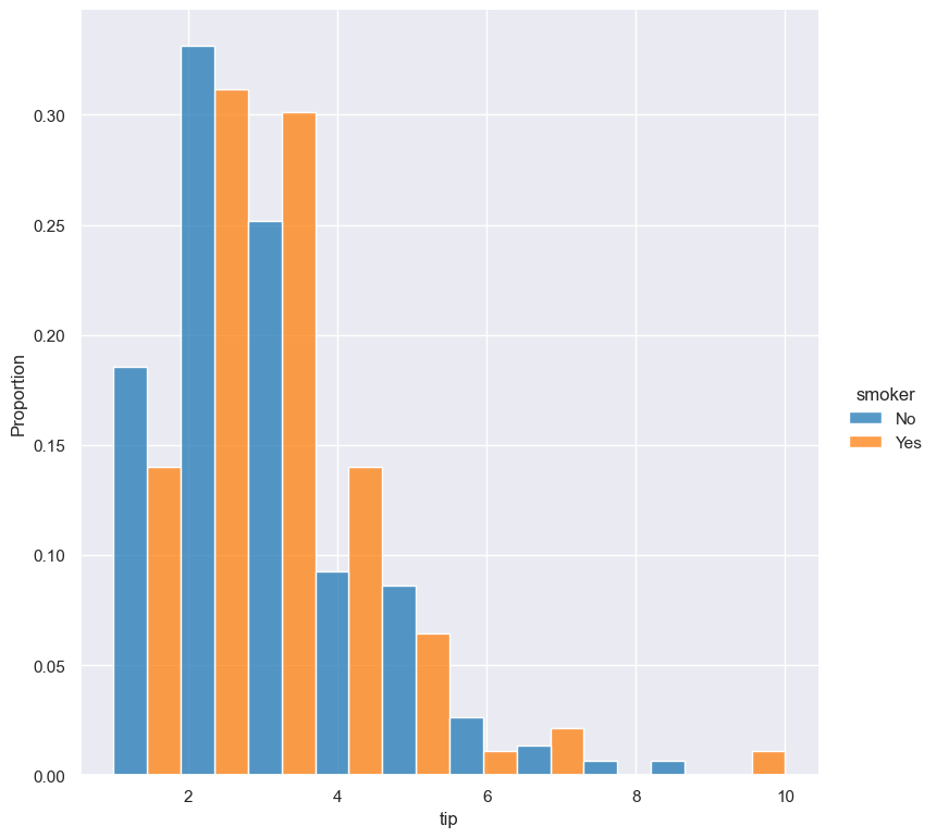
Compare the following plots that show a histograms of the tip column for each value of smoker using a proportion as the statistic.
In the example below the default normalisation occurs, across the entire dataset:
gurita hist -x tip --hue smoker --stat proportion --multiple dodge < tips.csv
And now the same command as above, but with the --indnorm argument supplied, so that each value of smoker is normalised independently:
gurita hist -x tip --hue smoker --stat proportion --multiple dodge --indnorm < tips.csv
Kernel density estimate
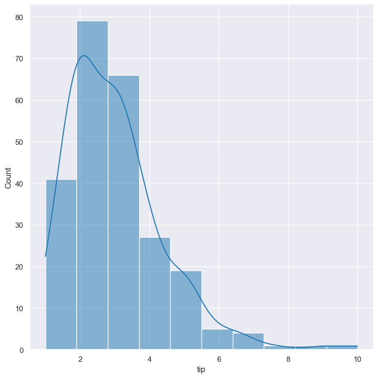
A kernel density estimate can be plotted with the --kde argument.
gurita hist -x tip --kde < tips.csv
Unfilled histogram bars
By default histogram bars are shown with solid filled bars. This can be changed with --nofill which uses unfilled bars instead:
gurita hist -x tip --nofill < tips.csv
Visual style of univariate histograms
By default univariate histograms are visualised as bars. This can be changed with --element {bars,step,poly} which allows alternative renderings.
The example below shows the step visual style.
gurita hist -x tip --element step < tips.csv

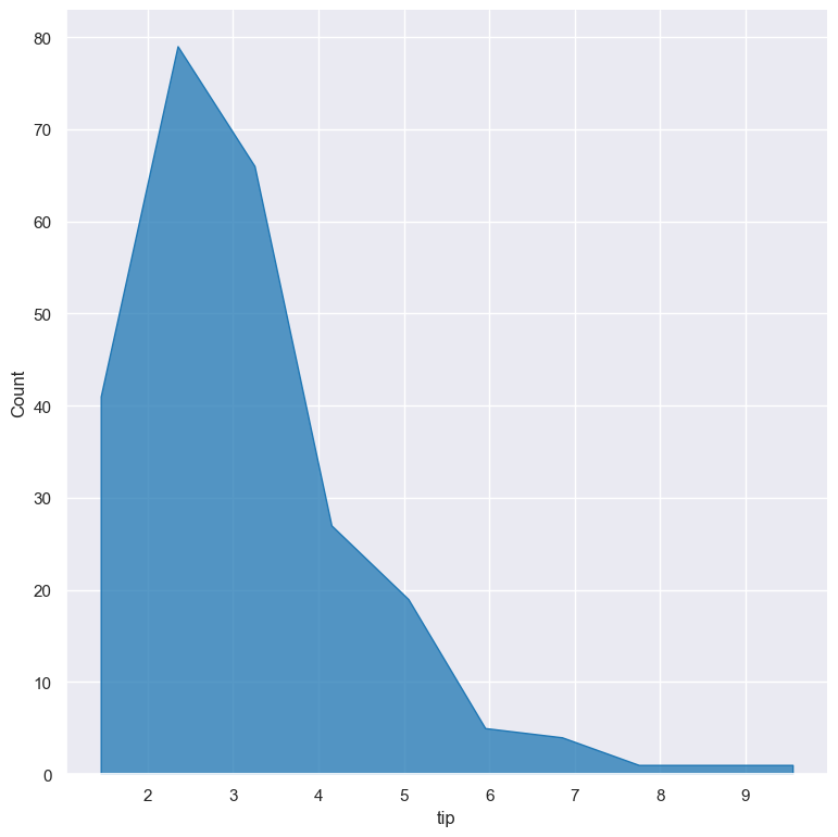
The example below shows the poly (polygon) visual style, with vertices in the center of each bin.
gurita hist -x tip --element poly < tips.csv
Log scale
--logx
--logy
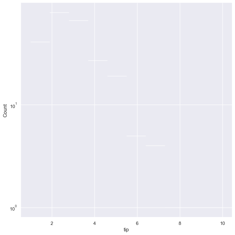
The distribution of numerical values can be displayed in log (base 10) scale with --logx and --logy.
gurita hist -x tip --logy < tips.csv
Axis range limits
--xlim LOW HIGH
--ylim LOW HIGH
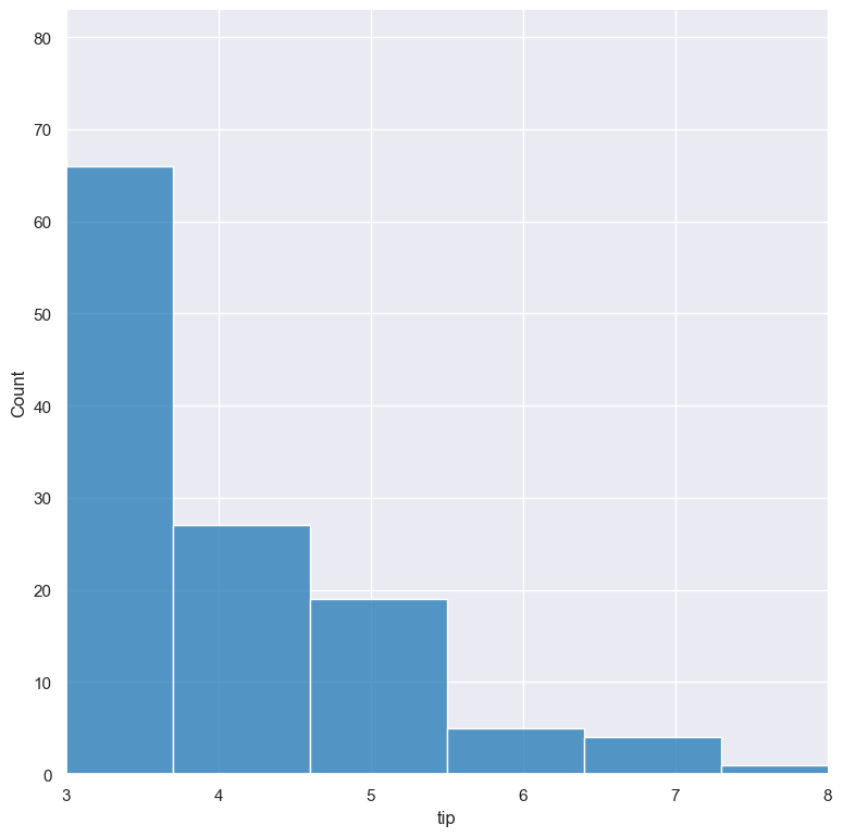
The range of displayed numerical distributions can be restricted with --xlim and --ylim. Each of these flags takes two numerical values as arguments that represent the lower and upper bounds of the range to be displayed.
gurita hist -x tip --xlim 3 8 < tips.csv
Facets
--frow COLUMN
--fcol COLUMN
--fcolwrap INT
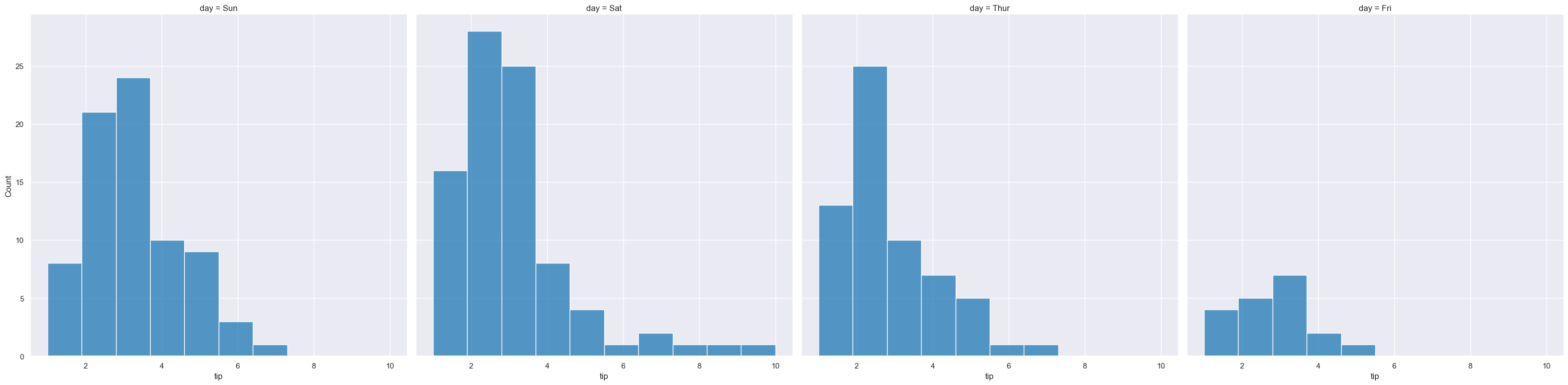
Scatter plots can be further divided into facets, generating a matrix of histograms, where a numerical value is further categorised by up to 2 more categorical columns.
See the facet documentation for more information on this feature.
gurita hist -x tip --fcol day < tips.csv