swarm
Swarm plots show the distribution of values in a numerical column optionally grouped by categorical columns.
Usage
gurita swarm [-h] [-x COLUMN] [-y COLUMN] ... other arguments ...
Arguments
Argument |
Description |
Reference |
|---|---|---|
|
display help |
|
|
select column for the X axis |
|
|
select column for the Y axis |
|
|
Orientation of plot. Allowed values: v = vertical, h = horizontal. Default: v. |
|
|
controlling the order of the plotted swarms |
|
|
colour and/or group columns by hue |
|
|
separate hue levels along the categorical axis |
|
|
order of hue columns |
|
|
log scale X axis |
|
|
log scale Y axis |
|
|
range limit X axis |
|
|
range limit Y axis |
|
|
column to use for facet rows |
|
|
column to use for facet columns |
|
|
wrap the facet column at this width, to span multiple rows |
See also
Similar functionality to swarm plots are provided by:
Swarm plots are based on Seaborn’s catplot library function, using the kind="swarm" option.
Warning
Swarm plots can be slow to render on input data sets with large numbers of rows. In cases where the swarm plot is too slow to render, consider using an alternative distribution plot, such as strip, box, boxen, or violin. Alternatively you can reduce the number of rows using a random sample of the data.
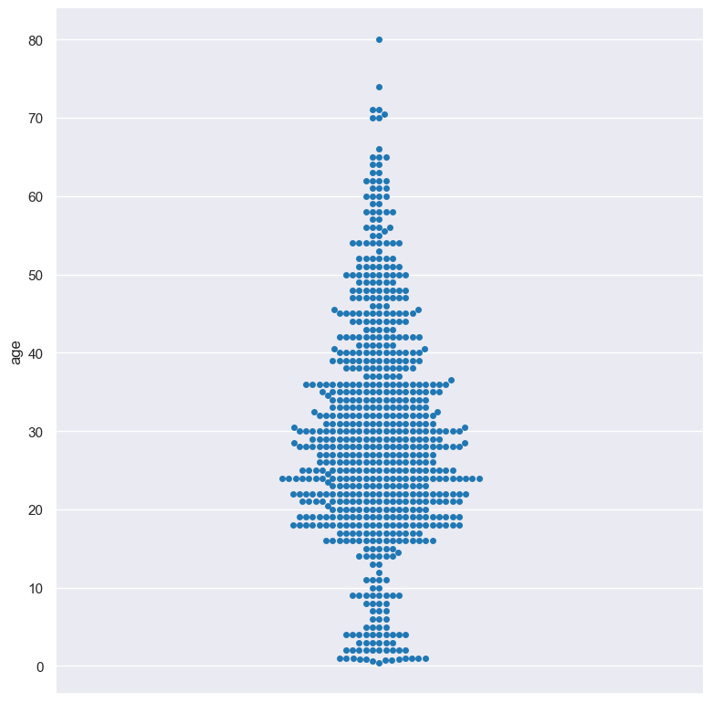
Simple example
Swarm plot of the age numerical column from the titanic.csv input file:
gurita swarm -y age < titanic.csv
The output of the above command is written to swarm.age.png:
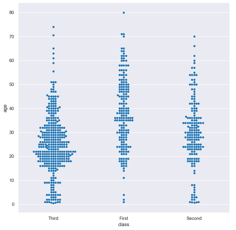
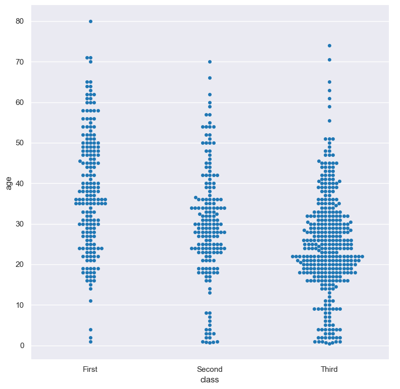
The plotted numerical column can be divided into groups based on a categorical column.
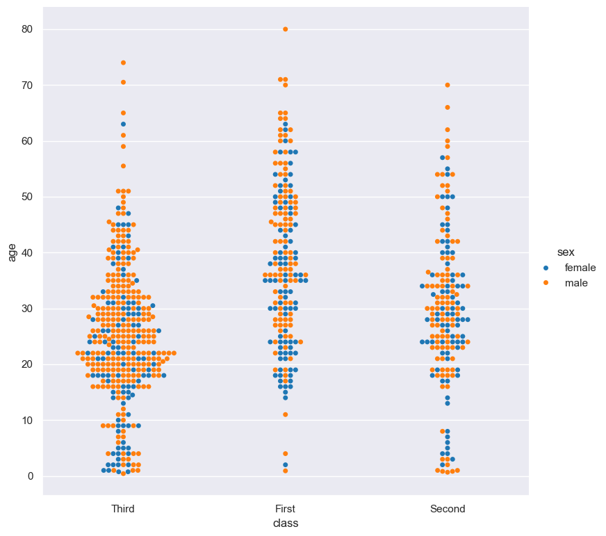
In the following example the distribution of age is shown for each value in the class column:
gurita swarm -y age -x class < titanic.csv
The output of the above command is written to swarm.class.age.png:
Getting help
The full set of command line arguments for swarm plots can be obtained with the -h or --help
arguments:
gurita swarm -h
Selecting columns to plot
-x COLUMN, --xaxis COLUMN
-y COLUMN, --yaxis COLUMN
Swarm plots can be plotted for numerical columns and optionally grouped by categorical columns.
If no categorical column is specified, a single column swarm plot will be generated showing the distribution of the numerical column.
Note
By default the orientation of the swarm plot is vertical. In this scenario
the numerical column is specified by -y, and the (optional) categorical column is specified
by -x.
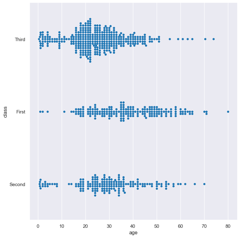
However, the orientation of the swarm plot can be made horizontal using the --orient h argument.
In this case the sense of the X and Y axes are swapped from the default, and thus
the numerical column is specified by -x, and the (optional) categorical column is specified
by -y.
In the following example the distribution of age is shown for each value in the class column,
where the boxes are plotted horizontally:
gurita swarm -x age -y class --orient h < titanic.csv
Controlling the order of the swarms
--order VALUE [VALUE ...]
By default the order of the categorical columns displayed in the swarm plot is determined from their occurrence in the input data.
This can be overridden with the --order argument, which allows you to specify the exact ordering of columns based on their values.
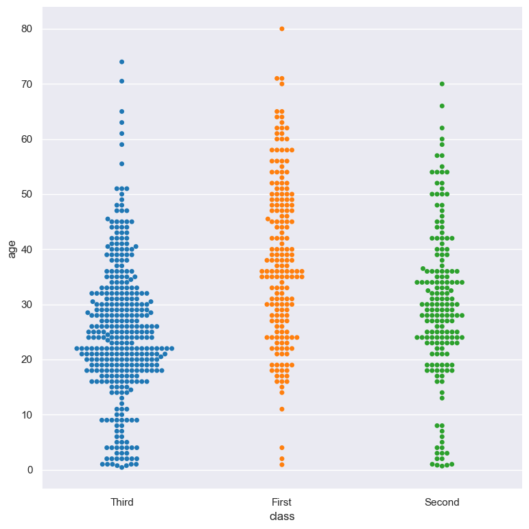
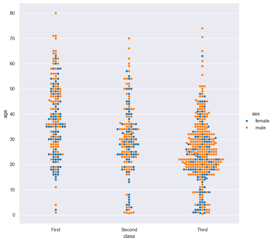
In the following example the swarm columns of the class column are displayed in the order of First, Second, Third:
gurita swarm -y age -x class --order First Second Third < titanic.csv
Colour and/or group columns with hue
--hue COLUMN
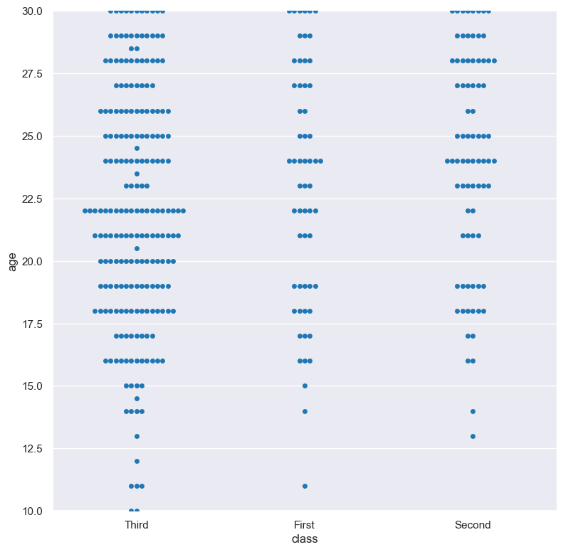
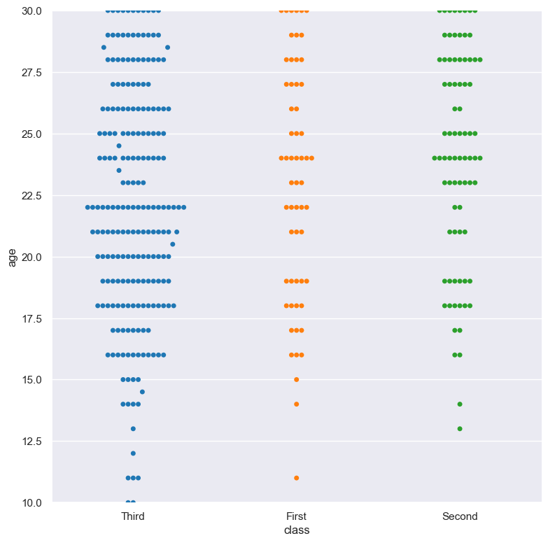
Each swrm can be coloured and optionally subdivided into additional categories with the --hue argument.
The following example generates a swarm plot showing the distribution of the age of titanic passengers across the three different ticket classes, where each class is coloured differently:
gurita swarm -y age -x class --hue class < titanic.csv
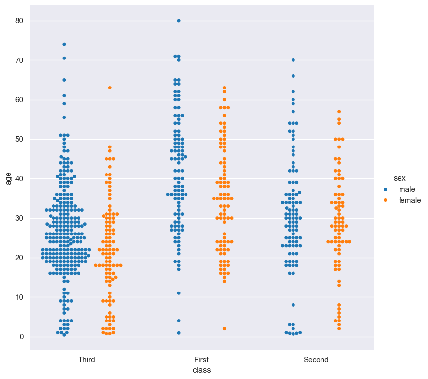
In the following example the distribution of age is shown for each value in the class column, and further sub-divided by the sex column:
gurita swarm -y age -x class --hue sex < titanic.csv
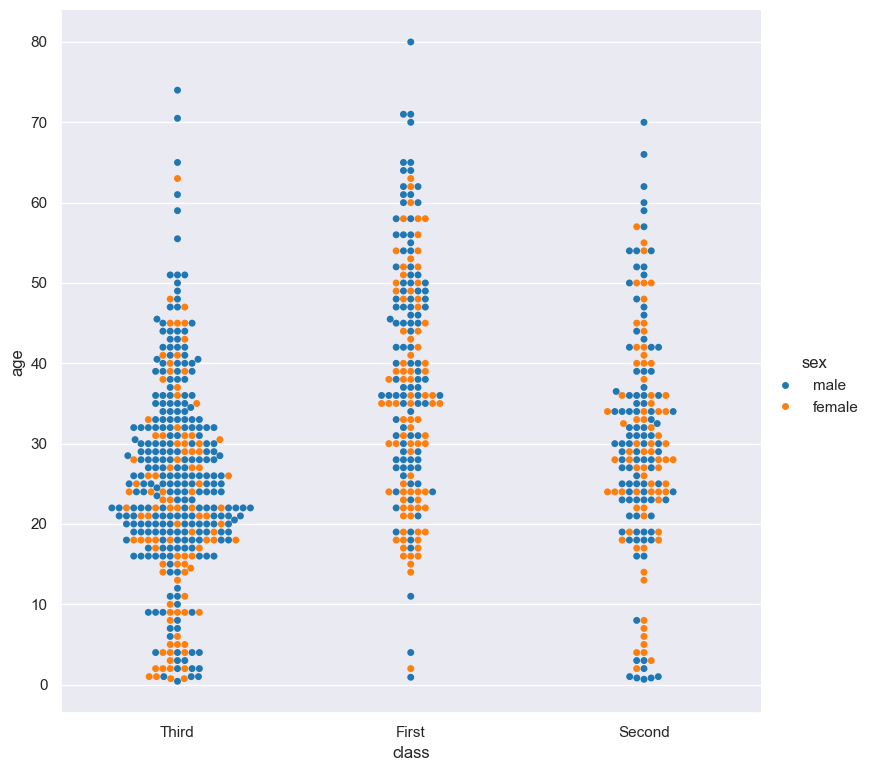
As the previous example demonstrates, when --hue is used, by default all hue levels are shown mixed together in the same swarm.
However, you might want to show each hue level in its own swarm. This can be achieved with the --dodge command.
The --dodge argument will separate hue levels along the categorical axis, rather than mix them together:
gurita swarm -y age -x class --hue sex --dodge < titanic.csv
By default the order of the columns within each hue group is determined from their occurrence in the input data.
This can be overridden with the --hueorder argument, which allows you to specify the exact ordering of columns within each hue group, based on their values.
In the following example the sex values are displayed in the order of female, male:
gurita swarm -y age -x class --hue sex --hueorder female male < titanic.csv
It is also possible to use both --order and --hueorder in the same command. For example, the following command controls
the order of both the class and sex categorical columns:
gurita swarm -y age -x class --order First Second Third --hue sex --hueorder female male < titanic.csv
Log scale
--logx
--logy
The distribution of numerical values can be displayed in log (base 10) scale with --logx and --logy.
It only makes sense to log-scale the numerical axis (and not the categorical axis). Therefore, --logx should be used when numerical columns are selected with -x, and
conversely, --logy should be used when numerical columns are selected with -y.
For example, you can display a log scale swarm plot for the age column grouped by class (when the distribution of age is displayed on the Y axis) like so. Note carefully that the numerical data is displayed on the Y-axis (-y), therefore the --logy argument should be used to log-scale the numerical distribution:
gurita swarm -y age -x class --logy < titanic.csv
Axis range limits
--xlim LOW HIGH
--ylim LOW HIGH
The range of displayed numerical distributions can be restricted with --xlim and --ylim. Each of these flags takes two numerical values as arguments that represent the lower and upper bounds of the range to be displayed.
It only makes sense to range-limit the numerical axis (and not the categorical axis). Therefore, --xlim should be used when numerical columns are selected with -x, and
conversely, --ylim should be used when numerical columns are selected with -y.
For example, you can display range-limited range for the age column grouped by class (when the distribution of age is displayed on the Y axis) like so.
Note carefully that the numerical
data is displayed on the Y-axis (-y), therefore the --ylim argument should be used to range-limit the distribution:
gurita swarm -y age -x class --ylim 10 30 < titanic.csv
Facets
--frow COLUMN
--fcol COLUMN
--fcolwrap INT
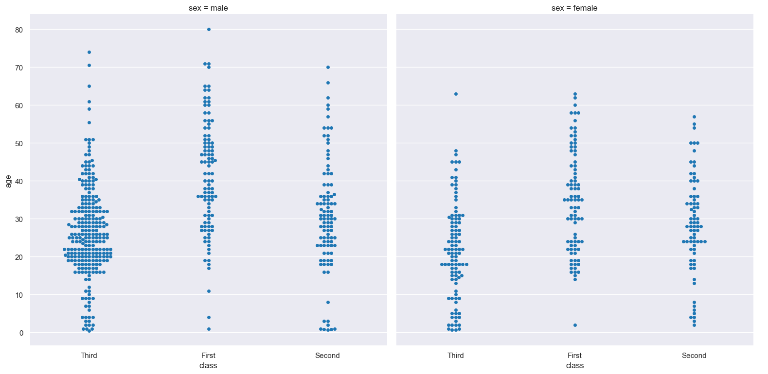
Swarm plots can be further divided into facets, generating a matrix of swarm plots, where a numerical value is further categorised by up to 2 more categorical columns.
See the facet documentation for more information on this feature.
The follow command creates a faceted swarm plot where the sex column is used to determine the facet columns:
gurita swarm -y age -x class --fcol sex < titanic.csv